

Information Architecture & Navigation
It’s an interesting to talk about the content strategy. How the content is structured in such a way that your target audience has no problem in navigation without getting confused. There are few factors:
- Labeling – What things are to represent the features
- Taxonomy – Classification of each label
- Information Architecture – Way to organizing and structuring content (SiteMap)
- Navigation – Design of IA that helps user to complete journeys
- Task – How things connect to each other (User Flow)
For example, you might want to place the best-selling fruits in front of users so that they are easy to grab them (IA). You grouped fruits and vegetables to separate rows as a way to organize them. For IA, card-sorting is one of the reliable method to find how user will response to certain content and functionality.
We were told to open General Assembly website and start analyse how’s GA sitemap is. It seems that GA organizes the information according to course duration (full-time, part-time, events..etc) which I think majority will look for when they browse this site.
CARD SORTING
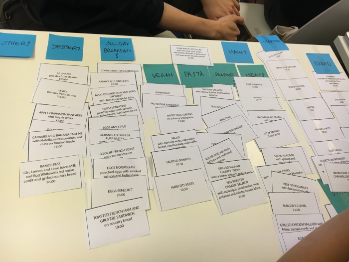
It is best to keep 1st-level category amount to be less than or equal to 7. Consider break down to more 2nd-level if exceeds.
Open-Sort: Let users to decide the category for the cards (didn’t give away how many categories are there)
Close-Sort: Pre-set categories and let user to put the cards in.
We were given a set of cards and asked to sort them out. Interestingly, each of the groups sorted cards into different 1st, 2nd levels even though we all sorted according to breakfast, seafoods, drinks..etc
Avoid:
- Jargon / Vague label
- Too many 1st-level categories
Common tools:
- OptimalSort (The only one I tried)
- xSort
- Usabilitytools
- Trello (free tool that enables drag and drop of to-do lists if you do not want to purchase)
Responsive & Native Design, Design Patterns
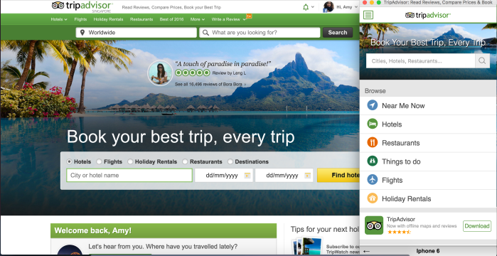
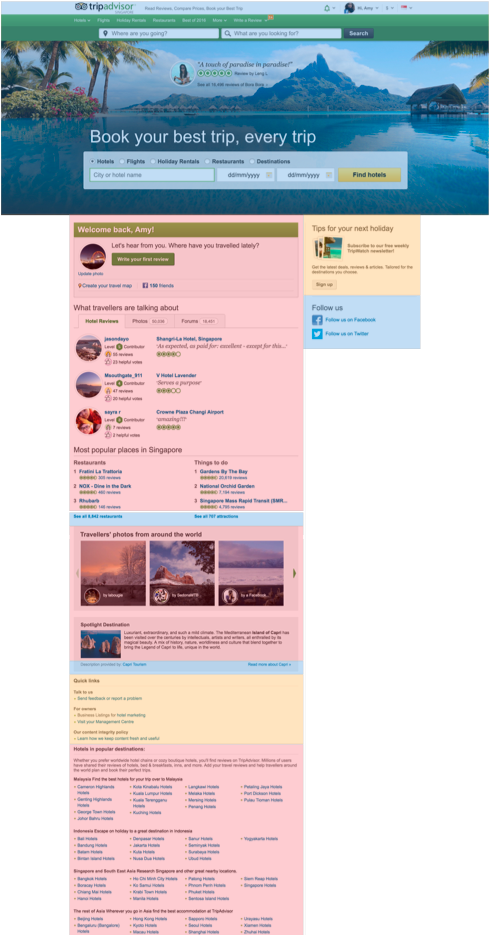
For the same website, it will be presented differently in desktop site and responsive mobile site as users has different purposes for each. For example at desktop website, user is more willing to do their transactions on accommodation but for mobile website, user might just want to browse through before making transactions. Due to limited screen size, the content in mobile will be more compact and focus.
There are 3 types of content:
- Main: Provides main experience value to helps user complete main goals (What user’s looking for)
- Supporting: Makes main content to be more trusted, interesting or informative
- Interface: Allows user to navigate the experience (connect with main & supporting and hook user to further engagement)
DESIGN PATTERNS
For design patterns, it is better to read through the design specs for the platforms.
Most of the designs are better to maintain consistency in various platforms.
iOS
Human Interface Guidelines, Bottom tabs, 3D touch, flat design..etc
Android
Material Design, Phone back/up buttons, Upper tabs, Card design..etc
http://android.inspired-ui.com/
Web
http://ui-patterns.com/patterns
http://zurb.com/patterntap http://zurb.com/responsive
http://bradfrost.github.io/this- is-responsive/patterns.html
REFERENCES:
- http://www.smashingmagazine.com/2012/02/finger-friendly-design-ideal-mobile-touchscreen-target-sizes/
- http://www.uxmatters.com/mt/archives/2013/03/common-misconceptions-about-touch.php
- http://www.lukew.com/ff/entry.asp?1085
- http://apptimize.com/blog/2014/04/6-ux-mistakes-to-avoid-when-designing-a-native-mobile-app/
- http://www.slideshare.net/AbbyCovert/make-sense-information-architecture-for-everybody
- http://boxesandarrows.com/card-sorting-a-definitive-guide/
- http://www.u1group.com/blog/article/information-architecture-mistakes-and-remedies
- http://www.intranetconnections.com/blog/5-common-information-architecture-pitfalls/
 Sesame.Notes