
![]()
LINDER
Have you ever learn any foreign language? Have you ever learn something through video or podcasts? You got some hands on learning a foreign language through vocabulary/phrases app and you are determine to take yourself a higher level.
You got yourself a video to learn in a fun way but you forgot what you learn as you have nothing to revise back (in case you replay the video)
You tried reading an article in that foreign language. You tried finding new word meaning via dictionary diligently but the process was getting more and more dreadful and eventually you stopped.
Wouldn’t it be awesome if an podcast app improves your language learning experience?
Here it is.
Introducing Linder, my project in UX design program in General Assembly.

Feel free to play with the prototype here: https://invis.io/H86WYUZUE
Too long? Read Linder in keynote format here.
My name is Amy Cheong. I’m a iOS Developer in Tigerspike and I learn UX to know more about a project planning process before development. I’m self-learning Korean and I’m really interested to find the next steps for learner who wish to continue to learn more besides vocabularies and grammar in a more context way.
Note: In this prototype, I used Korean as a language example for this project and some Korean resource are from TalkToMeInKorean.com
The journey begins
(Beginning) Problem Statement: People find it hard to continue their language learning journey after learning some vocabularies and grammars from app or web and relate them in context.
(Revised) Problem Statement
While language learning covers a lot of aspects, I decided to focus on the aspect in listening and reading. After (3)competitive analysis and (4)persona creation, I want to improve the learning experience in reading/listening podcast. The contents are broken down into parts for better digest. Overview of the context is provided to ensure users know what’s waiting for them beforehand and understand more while going through it.

Tools: Sketch 3, Keynote, Photoshop, Microsoft Word and Excel, and a lot of Sticky Notes
Team: Me, I’m grateful that I got my advice from my instructor, Katia whenever I faced any difficulties.
Solution
This product is called Linder. It provides vocabulary and grammar explanation in the context so that users do not need to go back and forth to check with dictionary while going through a podcast which dampen their motivation eventually. Learning language is supposed to be fun and engaging.

The process

1. Interview Questions

When I were planning for the interview questions, I would like to start out with the main questions which are:
WHY: Why they choose to study language?
WHAT: What are the resources they use to study?
HOW: How they usually study?
No matter if the user self-learning or attending classes for a language, exploring their habits and what’s they most likely to find as a extra tools/ resources help me to understand their learning behaviours. By knowing frustration points and what’s demotivates them are crucial to find a gap hole to improve current state and reduce the chances of lost interests.
2. User Interviews + Data Synthesis
People interviewed: 6 persons
Age range: 20-30 years old
Most of the interviews were done over Skype video calls as most of them were busy and from other remote areas.

A few of them stopped their learning due to their focus shift on work while others maintain a routine learning time (daily /weekly).
One common finding within self-learners, they are more willing to find wide range of methods for study such as Twitters or interest-related articles while people who attending class most likely stick to their textbooks.
Most of the users rely heavily on books. Even though they had played with some apps, those apps aren’t provide enough learning depth(vocabulary/phrases only) for them which lead them to stop using after awhile.

3. Competitive Analysis
For competitive analysis, I did not focus only on language podcast related resources, I had made comparison on other language teaching websites/app as well (vocabulary/phrases app etc). This is to discover elements that encourage continuous learning (motivation) and best practices in balancing content and fun elements in learning system.
 Key findings (and Room for improvements):
- UI is one of the important factors as user lost focus on the main features if the webpage displays a wide range of features everywhere and pop out window leads user to elsewhere which creates frustration. In Erin.ne.jp website, while the content is very diverse and resourceful, make some of first-timer learners stop exploring as the look and feel is outdated and confusing info architecture.
- Content in language learning has to be natural, authentic structures because user will not find them useful as some of the app’s vocabs and sentences are awkward and irrelevant to daily uses or context which leads them to stop (Eg. Elephant drinks milk).
- Some assistances like pictures, content breaks, audio speed, hint explanation, scripts are the little things add up and create a better user experiences as user are less demotivated by the difficulty in learning.
- Gamification, level-based, story-based system are ways to make learning process fun and develop a flow in learning for user.
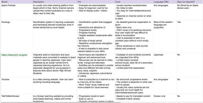
Detailed competitive analysis can be viewed here.
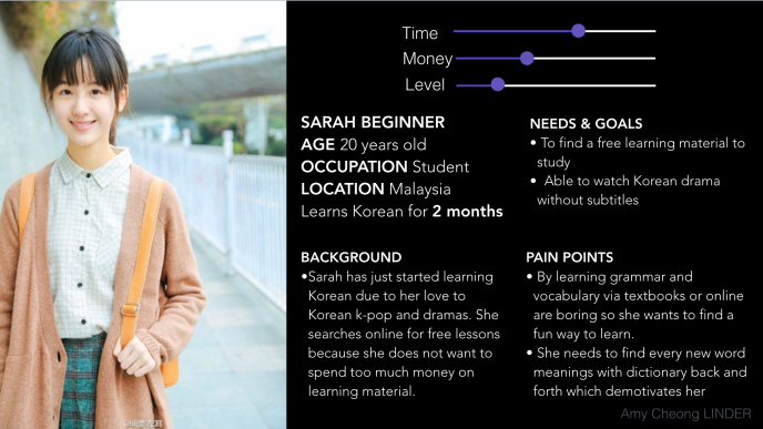
4. Persona
For Linder, I created two personas based on user interviews and data synthesis. Why I created 2 personas? After interviews on users with different levels, I separated users into complete beginner(Sarah) and user who learned fundamentals in intermediate level(Michelle). This is because both of the users has different concerns in different learning stages.
1. Sarah (20 years old) has just started learning Korean due to her love to Korean k-pop and dramas. She searched online for free lessons because she does not want to spend money on learning material.
Needs: Want to learn as much fundamentals as possible
Content: More on grammars, podcasts with English explanation to ease them
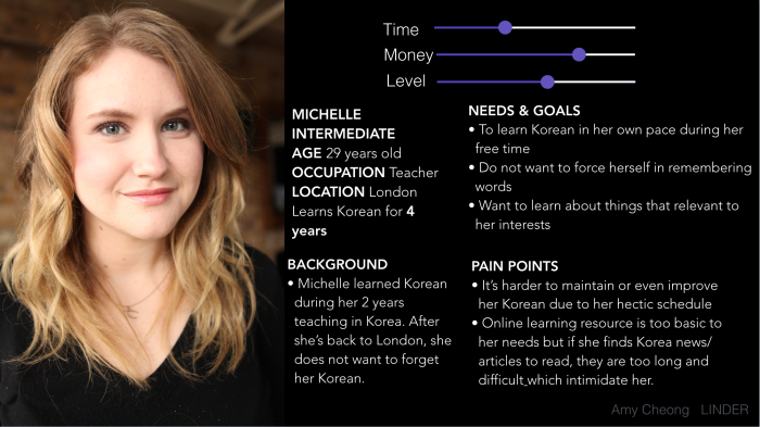
2. Michelle (29 years old) is a intermediate learner as she learned during her 4 years teachings in Korea. She wants to practise her Korean from time to time despite her hectic schedule because she feels wasteful to forget what’s she had learned.
Needs: Want to conserve learned knowledge and avoid further deterioration due to lack of practices
Content: Podcasts in raw native language to let them expose more
5. Revised Problem Statement
I drafted some of the user flows that defines my persona’s user goals. Based on my persona’s goals, learning a language needs lots of practices in 3 main core area:
- Reading,
- Listening and
- Language Knowledge(Vocabulary/Grammar)
Based on personas in Sarah and Michelle case, in most usage, they need something to use in random time (lunch breaks, commute time) and to cater their language needs so…
I narrowed and revised my problem statement again from
improve continuous language learning
to
How might we
Create… a better podcast experience
For… language learning user
To… start or continue to learn language
As mentioned in the beginning of the article, while language learning covers a lot of aspects, I decided to focus on the aspect in listening and reading. I want to improve the learning experience in reading/listening podcast.
6. Features Prioritization
Before determine what’s features should be included in Linder’s MVP, I listed out features and justify how the features were related according to my research. By listing, it helped me to analyse the importance of the features and technology constraint whether if it is a must have, should have, good to have, or won’t have.
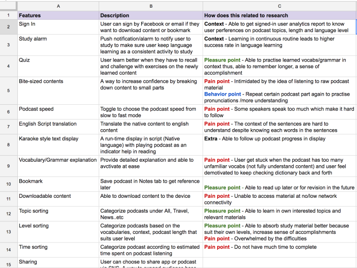
Detailed features list can be viewed here
MoSCoW method

Key features
- Bits-sized content: Users are often intimidated by the long content of podcast or articles which made them only focus on textbook reading. I’m excited but challenged to create a continuous (for the flow) but bits-sized podcast content.
- Content sorting (Topic, Time, Level): Both personas are more willing to read things that interests them rather than rigid content (eg. zoo animals which they don’t see them every day)

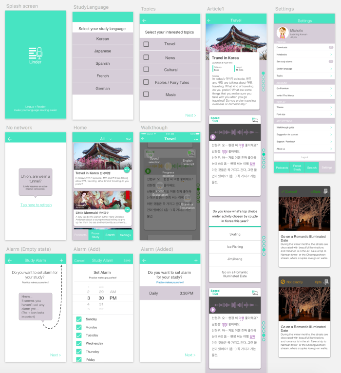
7. Minimum Viable Product (MVP)
After prioritising the features, I decided the MVP will be the product which
user can listen to podcast along side with script on real-time.
The scope of the project is being narrowed down due to the course time constraint and I can focus on the core functionalities based on the importance for the personas. This can avoid decision paralysis if user are being expose to too many good-to-have but less value features.
Myth #12: More choices and features result in higher satisfaction
For example, I decided to take out the leaderboard concept as the need for community is not important enough to be for the moment based on persona behaviour.
8. User Flows

The happy paths are very simple because the aim is to let the user listen to podcast, use podcast tools to ease the learning and able to have the options to choose to do the quiz after the podcast to strengthen their memory on learned vocabulary in context.
I decided to take out Sign In process at first install and prompt them to sign in when they want to download or use the app for a certain number of times so that:
– To reduce the installation steps on first launch to get to podcast content to experience
– To get “serious” language learner and the able to cater publish more contents based of their preferences in reading
9. Paper prototyping + Basic usability testing (Think Aloud)


Interviewed 2 person
Tools: Invision, Paper
Paper Prototype Usability Test Setup
For low-fi prototype, I did only the major screens: first installation process, podcast list page and podcast detail page. I didn’t set any tasks yet for this yet but just to ask them to navigate around and what did they think of the page does.
What I did during usability test
1. I observed and noticed why did user pause and their behaviour.
2. I encouraged user to speak what their think, what’s their impression on new screen and what is the expected behaviour of pages.
Design Implications
1. Unclear buttons and switch: Some users confused and asked me what’s the buttons while some ignored the buttons.
2. User don’t get meaning of “I want to study at _”: For first installation, the rate that user will set an study alarm is very low because user had yet to see any content of the app and want to skip to the main content quickly thus, the page makes little impact.
Change: Shifted alarm page to settings page and will prompt user of this alarm feature when user launch the app for a number of times.
10. High fidelity prototyping + Usability testing (Think Aloud)
Interviewed 4 persons.
High-Fi Usability Test Setup
I have reference Steve Krug’s usability test script declaration and make some changes accordingly.

Major Design Implication
Card pattern: The design caused confusion on the state of flow. User assumed the page navigation is swiping right or left to the next content in podcast detail page where actually it should be navigated by scrolling vertically.
I still found that users were still having problem in the navigation.
Change: Discarded card pattern design and use solid line and dotted line as a podcast progress indicator.

Read more usability test overview results here
11. Final high fidelity prototyping

Feel free to play with the prototype here: https://invis.io/H86WYUZUE
Noticed that I made a major change in the design by taking out card design pattern as it blocked and confused user.
For final high-fi prototype, I took time to explore Keynote, Invision and Sketch as it is very important to have prototype to feel real product which enable users to give more feedbacks as they interact with it.
Tools: Keynote (Gifs), Invision, Sketch
Engagement
Learning language is a long journey so app engagement plays a crucial role.
Tools that enhance podcast experience
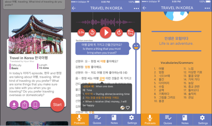
I put a lot efforts in developing “clear” podcast buttons and standard design flow so that the learning curve of Linder use is lower by listening to users’ inputs and read about Apple UI standard guidelines.

Karaoke-style Text Display

Rewards and Motivation

Motion Transition
I added in motion transition to present user summary of the podcast. Research showed that users have better understanding if they know what’s the content beforehand. When user scrolled down to read script, the navigation bar is hidden to give out more space for user to read.

Inspired from: http://bit.ly/1NmiDEO
What I have learn
Change confusing design
When the same concern is brought by different user again and again, listen and act on it. Change it if it is valid. Following the wrong design pattern stops user from proceed to the next stage that ends up stop discover the gem of your app.

One thought on “UXD General Assembly – Linder [Full Report]”